
Projects
Real projects that started where you are now.
Some of these businesses had no website at all. Others had DIY sites that weren't working. All of them wanted something better — clearer pages, easier navigation, and a site that actually helps bring in more enquiries.
Transformations
Upgrades from DIY or outdated sites into something that feels premium and easy to use.
Transformation
Client projectTardi-Group
Clear, modern site that actually explains what they do.
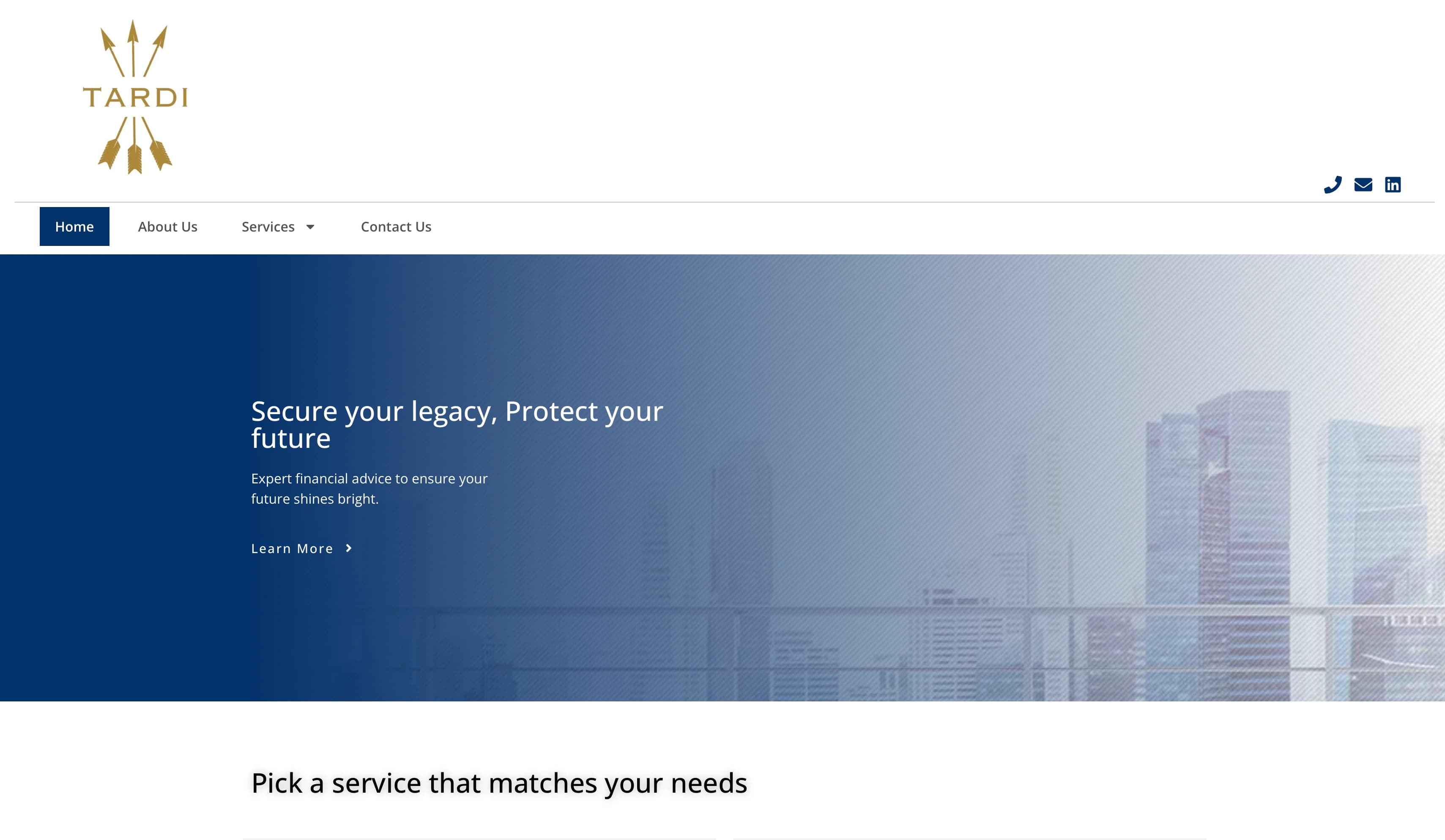
Before
Their old WordPress site looked dated and confusing. Visitors couldn't figure out what services they offered or why to choose them. It made a strong business look smaller than it really is.
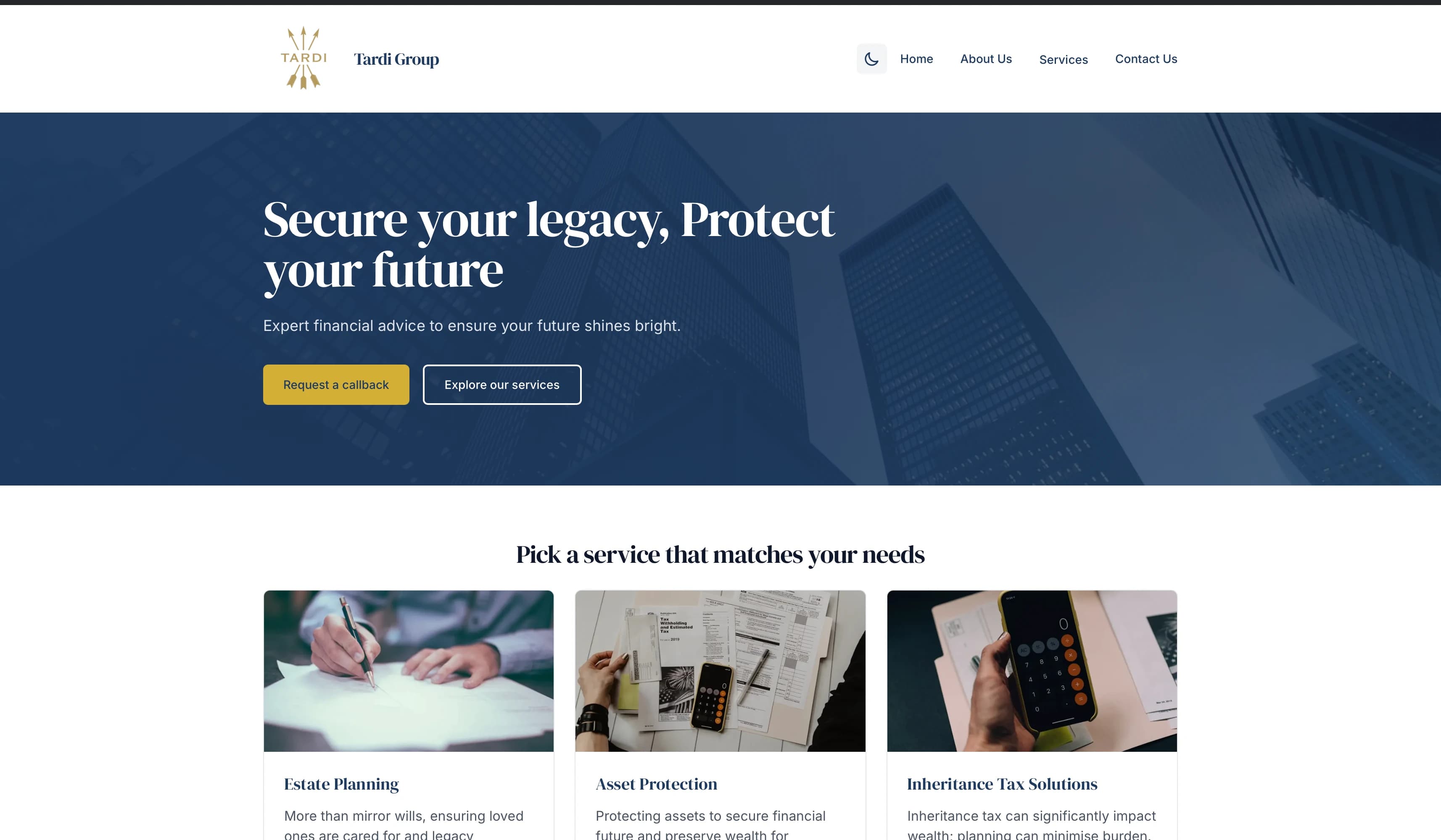
After
Now the site loads fast, looks professional, and makes it immediately clear who they are and what they do. Visitors can easily find what they need and understand why Tardi-Group is the right choice.
Key improvements
- Much easier to navigate and find information
- Loads faster on all devices
- Looks more professional and trustworthy
- Works great on phones and tablets
- Clearly explains all their services
“The new site finally feels like us. People actually understand what we do now.”
— Joe Tardi, Founder
Outcomes
- Visitors now understand their services within 30 seconds of landing on the site
- Professional appearance helps them compete with larger firms
- Mobile traffic increased as clients can easily find information on phones
Transformation
Client projectMMM Beauty
A booking journey that feels premium, not patchy.
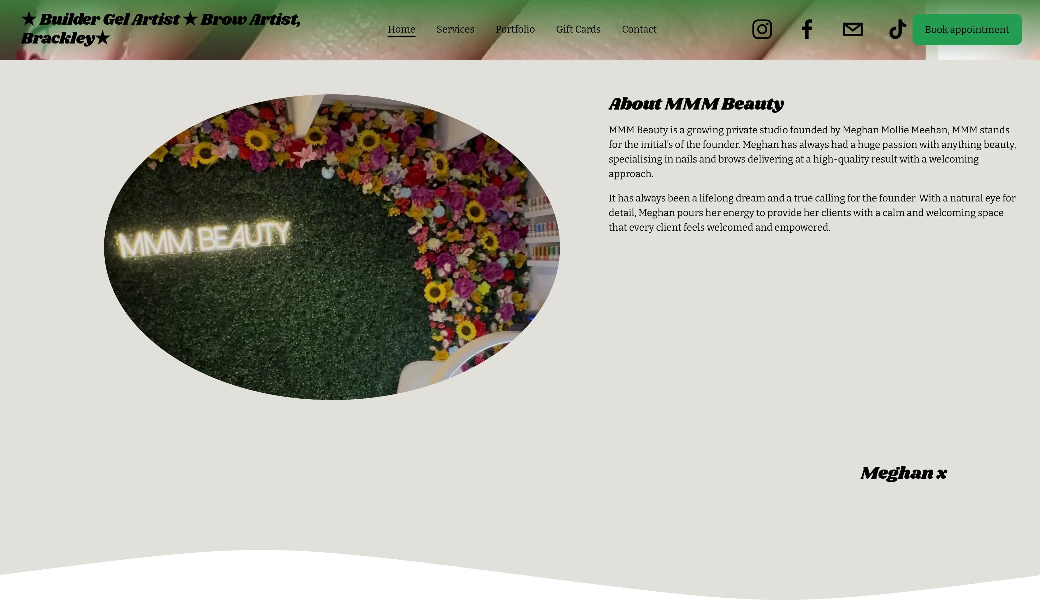
Before
Their old Squarespace website was confusing. Service pages were hard to find, prices were unclear, and booking appointments was frustrating. New clients often gave up before booking.
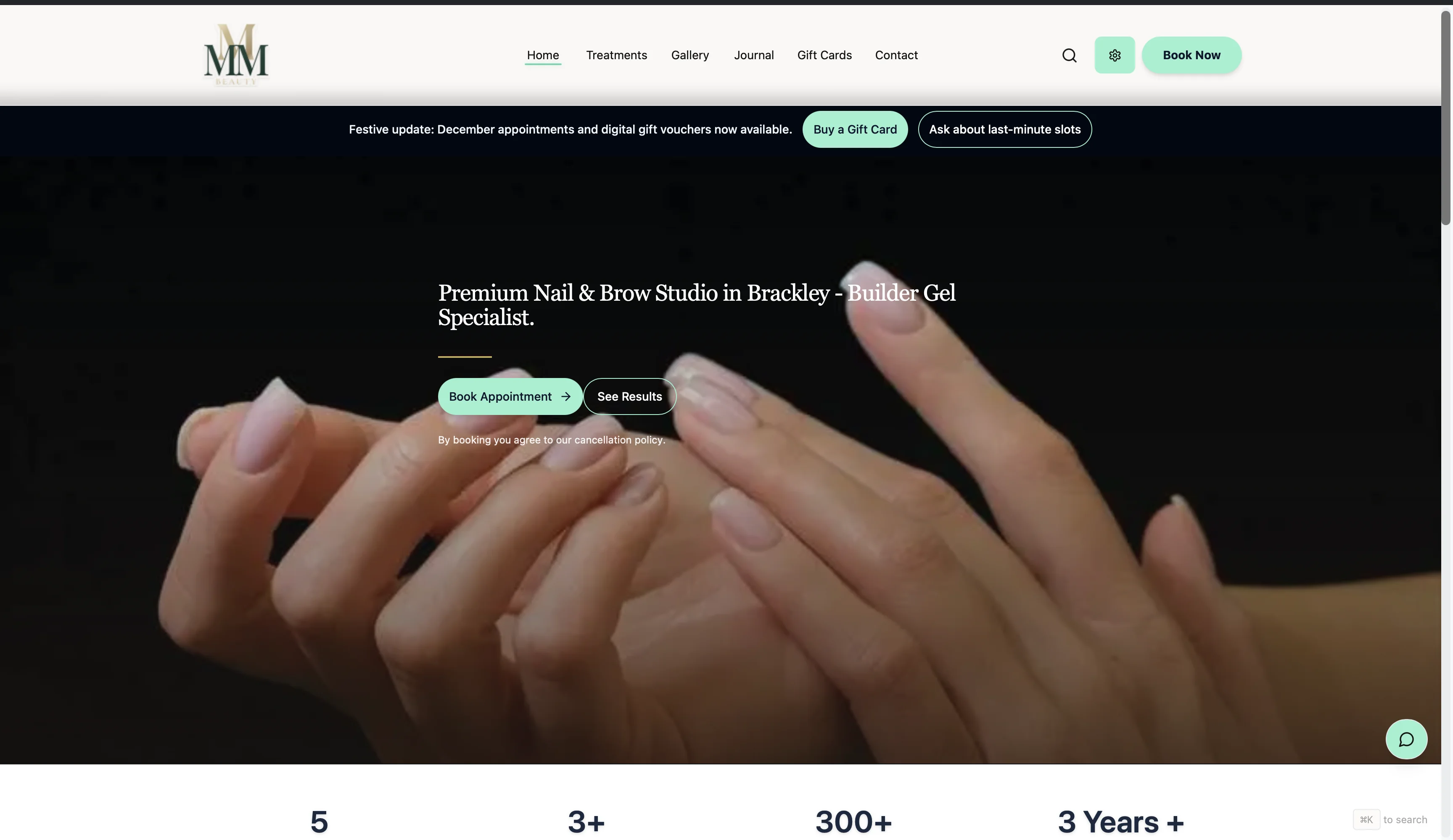
After
Now everything is clear and easy. Clients can quickly see all services, understand pricing, and book appointments without confusion. The whole experience feels smooth and professional.
Key improvements
- Much easier to book appointments online
- Clear service pages with all the details clients need
- Works perfectly on phones for busy clients
- Looks premium and professional
- Clients can see exactly what to expect
“Clients said the site looks expensive and is so much easier to book on.”
— Meghan Meehan, Owner
Outcomes
- Online bookings increased as clients can easily see services and pricing
- Premium appearance justifies higher service prices
- Mobile clients now complete bookings without calling for clarification
First websites
Complete online identities for businesses who had no site or only social media.
First Website
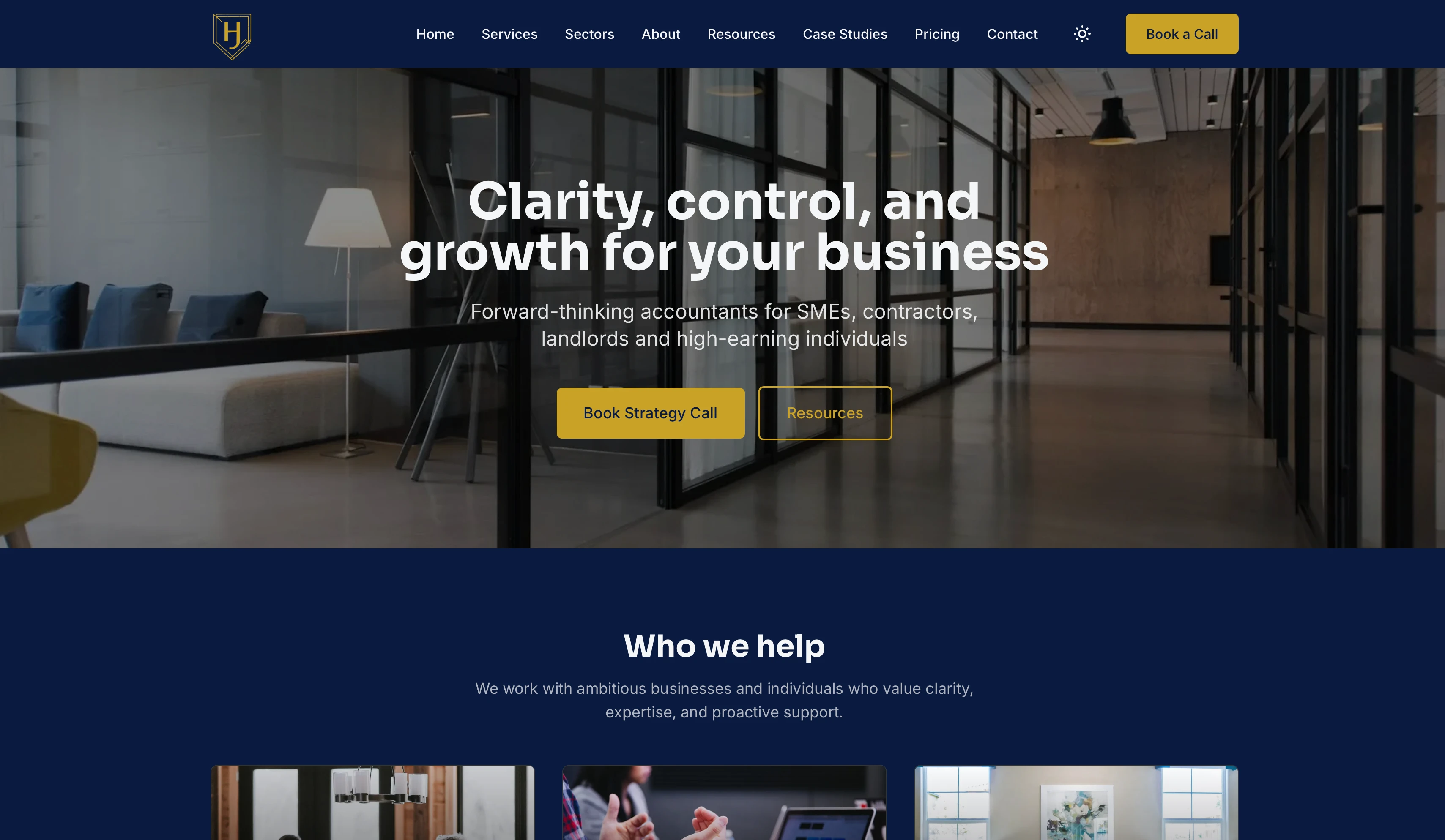
Client projectHarrison James Accounting
A complete online identity for a brand-new financial services firm.
Challenge
They had no website at all. When potential clients searched for them, nothing came up. It was hard to build trust in an industry where credibility matters.
Solution
A professional website that explains their services clearly, builds trust with potential clients, and looks as reliable as the service they provide. Now clients can find them easily and understand exactly what they offer.
Key improvements
- Professional website that builds trust
- Clear explanation of all their services
- Easy for clients to contact them
- Looks reliable and established
- Works great on all devices
“It gave us a proper online presence that matches how we work in real life.”
— Harrison James, Director
Outcomes
- New clients can find them through search and understand their services
- Professional appearance builds trust in the financial services industry
- Clear contact information makes it easy for potential clients to reach out
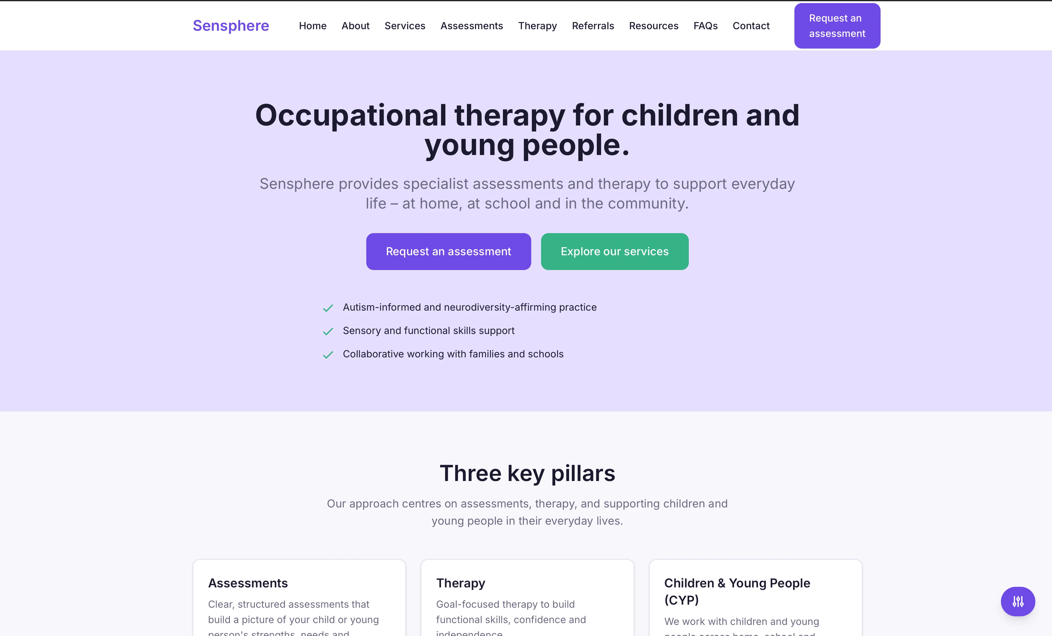
First Website
Client projectSensphere
A complete online identity for a new occupational therapy service.
Challenge
They had no website. Families couldn't find them online or understand what services they offered. Parents needed clear information about assessments and therapy options, but had nowhere to find it.
Solution
A warm, friendly website that explains everything clearly. Parents can easily understand what assessments involve, what therapy options are available, and how to get started. The site feels approachable and trustworthy.
Key improvements
- Clear explanation of services for families
- Easy to understand what happens in assessments
- Simple way to get in touch or make referrals
- Warm, approachable design that builds trust
- Works perfectly on phones for busy parents
“Parents said it's much clearer and less overwhelming than our old materials.”
— Sensphere Team
Outcomes
- Families can easily find them online and understand assessment services
- Clear information reduces overwhelmed feeling for parents seeking help
- Simple contact process increases referral inquiries from professionals
Seen enough?
Want results like this for your business?
Whether you're starting from scratch, only have social media, or need to upgrade a DIY site, we'll map the quickest path to a site that feels professional and brings in more enquiries.